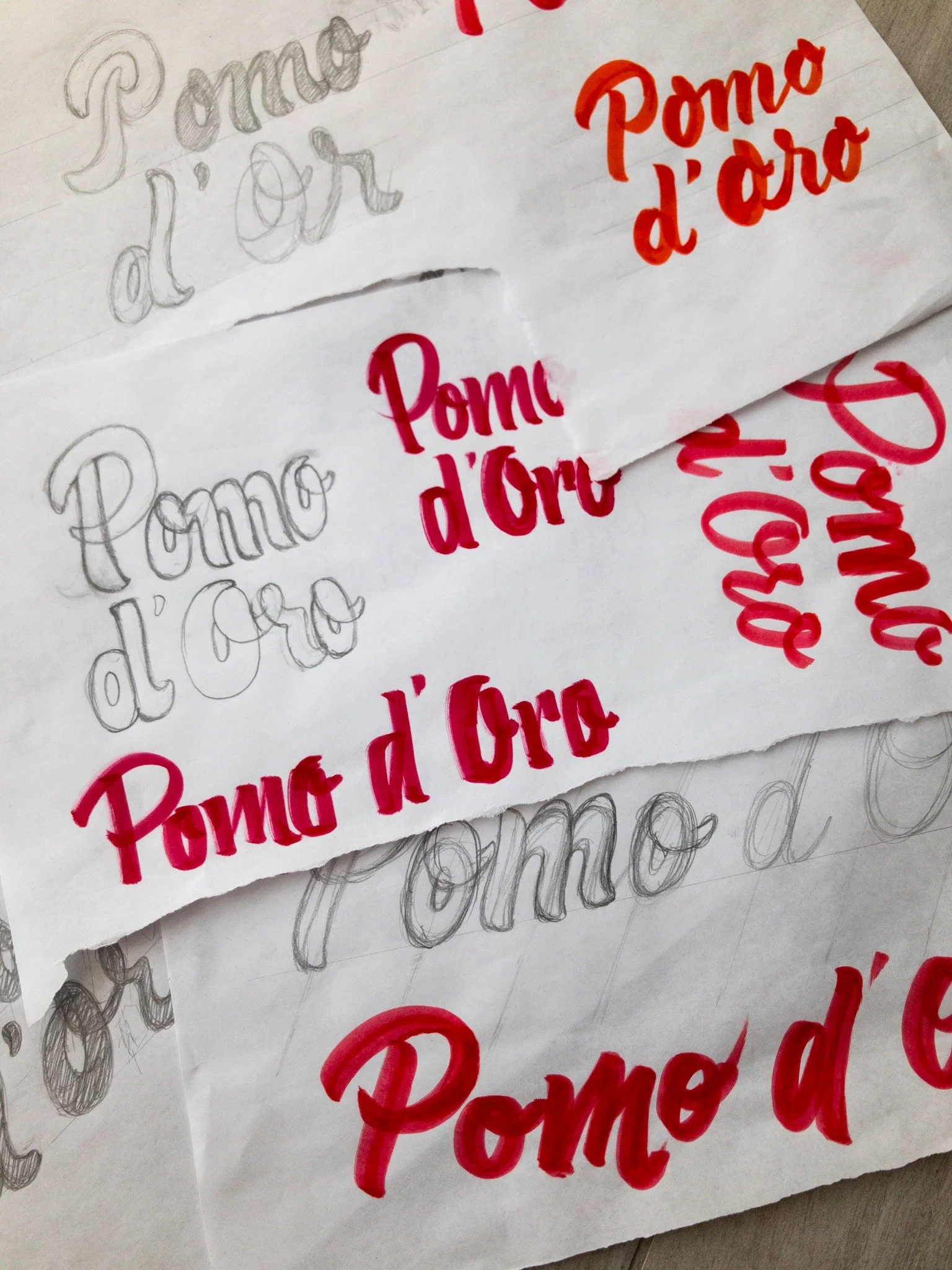
Pomo d’Oro is a take-away pizzeria with various locations in Vicenza (Italy). As a personal project, I decided to make a restyling of their visual identity because it looked old and unattractive for a pizzeria. I decided to remake the logo with a custom lettering, which resembled the brush script style, to make it more readable and dynamic.
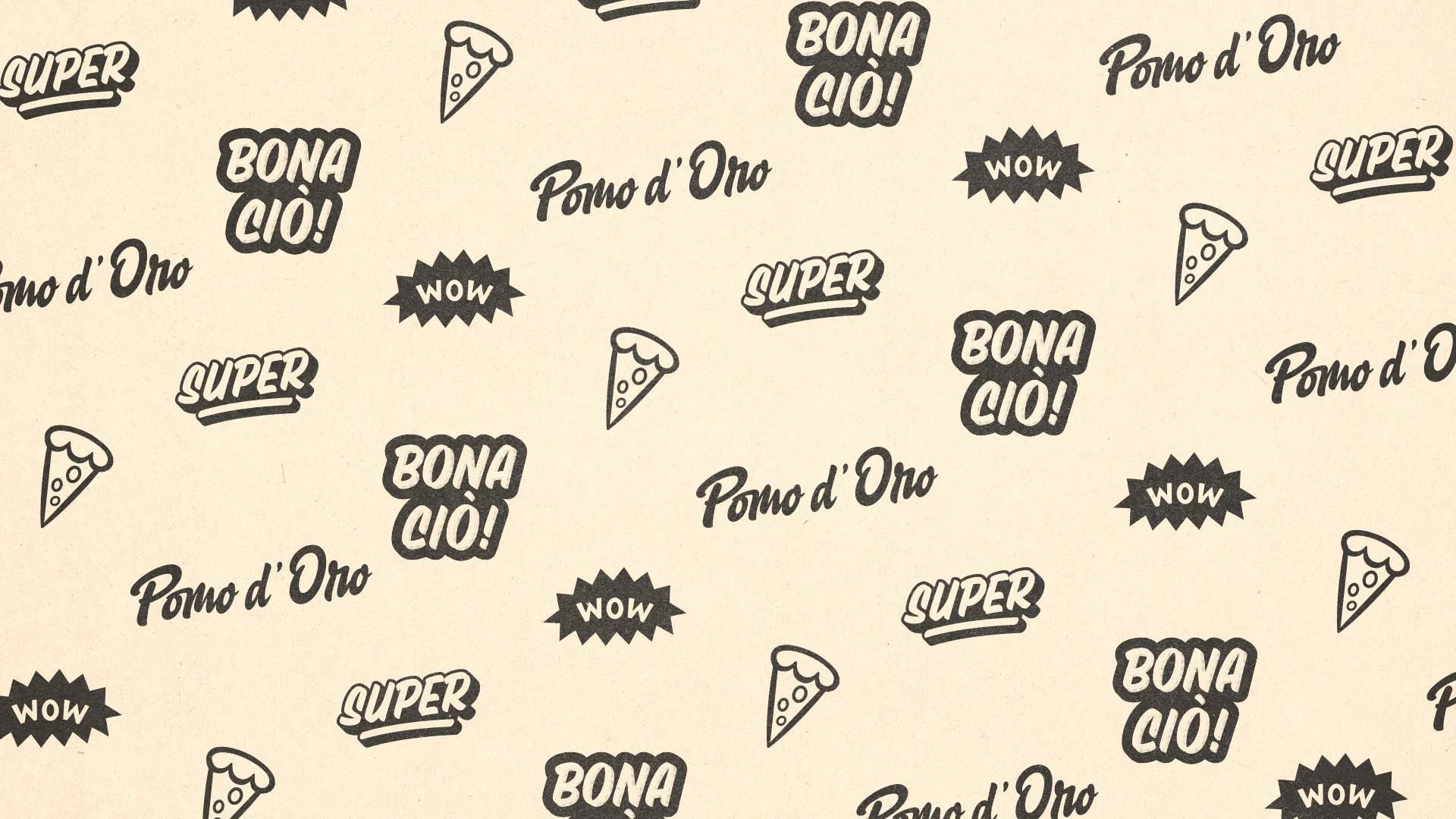
To make the brand unique I did some lettering and illustrations that will then create a pattern for the packaging. This includes “Broccolini”, the typeface I crafted in 2023. Both are the key elements of Pomo d’Oro’s brand identity; they create the tone of voice and represents the brand’s purpose in a fun and playful way in any kind of communication.
If you want to see the complete project, check my Behance page.